Item Menu Design and Implementation 11/01/2019
Item UI
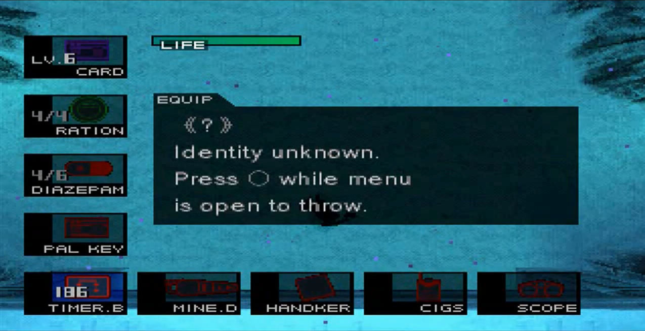
When designing the item UI I considered looking at two things: the way my influencers handled item selection, and how similar games handle item selection. One of my direct influences working on this project was the Metal Gear franchise. In Metal Gear items are displayed on the bottom left (Items) and bottom right of the screen (Weapons), with the current items or weapon being shown at all times. When the respective menu button is pressed the items are shown above and to the side of the current item, allowing the user to cycle through them.

I then looked at a modern game with similar mechanics, in this case, I looked at the game Enter the Gungeon. Enter the Gungeon has a similar item selection screen to the Metal Gear series. However, instead of having all the items listed all the way up the side and bottom of the screen, they opt for a more minimalist approach taking up less screen space.

Design
Ultimately I decided this style of weapon/item switching is not only still effective, but for me was evocative of the Metal Gear series and as this was my main inspiration for the game. I decided to go with it albeit with a few minor changes. Firstly the game will only show 3 weapon or item cards at any one time (there are however 4 item cards, one is hidden), this is for 2 main reasons. The first of which is that it saves on screen space making for a more minimal UI, and also allowing the player to see more gameplay while switching weapons. The second reason is that having every item be represented by its own UI object could cause performance issues. In order to achieve this, I would either need to instantiate a new UI object whenever the player picks up a new item (this would be resource intensive) or I would need one UI object for every item to exist from the beginning.
While I could scale up this method to cover the whole screen I think that this would be unnecessary as the core feel of this mechanic is maintained.
Implementation
As previously discussed I decided to implement a limited box system. The core functionality of which would revolve around having 4 item boxes that rotate positions based on their position in an array. The positions in this array are as follows: 0 - Previous item, 1 - Current Item, 2 - Next item, 3 - Hidden items.
Firstly I update the item cards to display the relevant information (currently only changes the name) based on their position in this array (Note: only updated on cycle and menu opening). Once the menu input is given and the menu is open, I then check for a directional input to cycle the menu in. Once this is done the program shifts the item to the position of either the next or the previous (depending on the direction inputted). When all of the item UI objects are moved the relevant array is updated with the new positions in the array.
There are a few other touches I added, such as interpolating between the positions to make it a smoother process, but that’s the core concept of it.