UI Design 08/02/2018
Design - UI
Below are some images showing how the UI in the game should work. They aren’t extremely detailed, this is because the main focus of this project is the programming side. While I will still be creating these kinds of design documents, I ultimatly will not be marked on them at the end of the module.
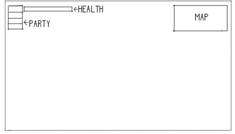
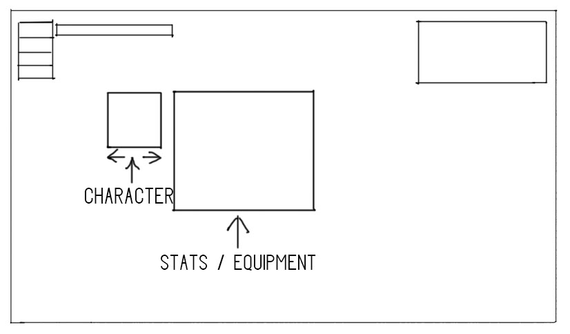
The first image shows the main UI, the health bar is in the top left and the party members (lives) are to the left of it. The current party member selected will be the one directly adjacent to the health bar, when the player dies this icon will be removed and the next one will be moved up. There will be a map in the top right of the screen which will show the area around the player, this is to make it clearer as to where the player has been / where they need to go. The second image shows the inventory / stats menu. This will show the player their currently equiped equipment and the stats of the current party member. This will also show the player’s inventory and allow them to use and equip items.

